Osteoid
Roles: Senior Graphic Designer, Graphic Designer
Responsibilities: Print & Digital, Branding, UI icon design, Creative Direction, Splash Screens, Packaging, Visual Design, Product Photography, Motion, Copywriting
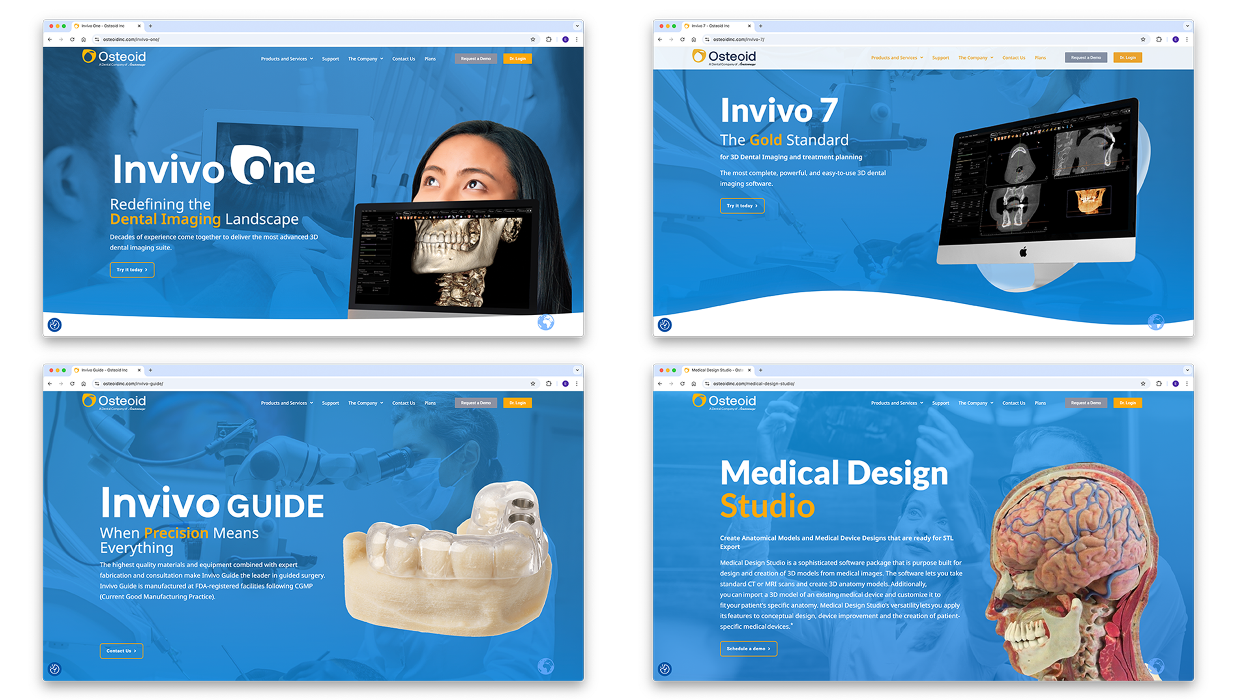
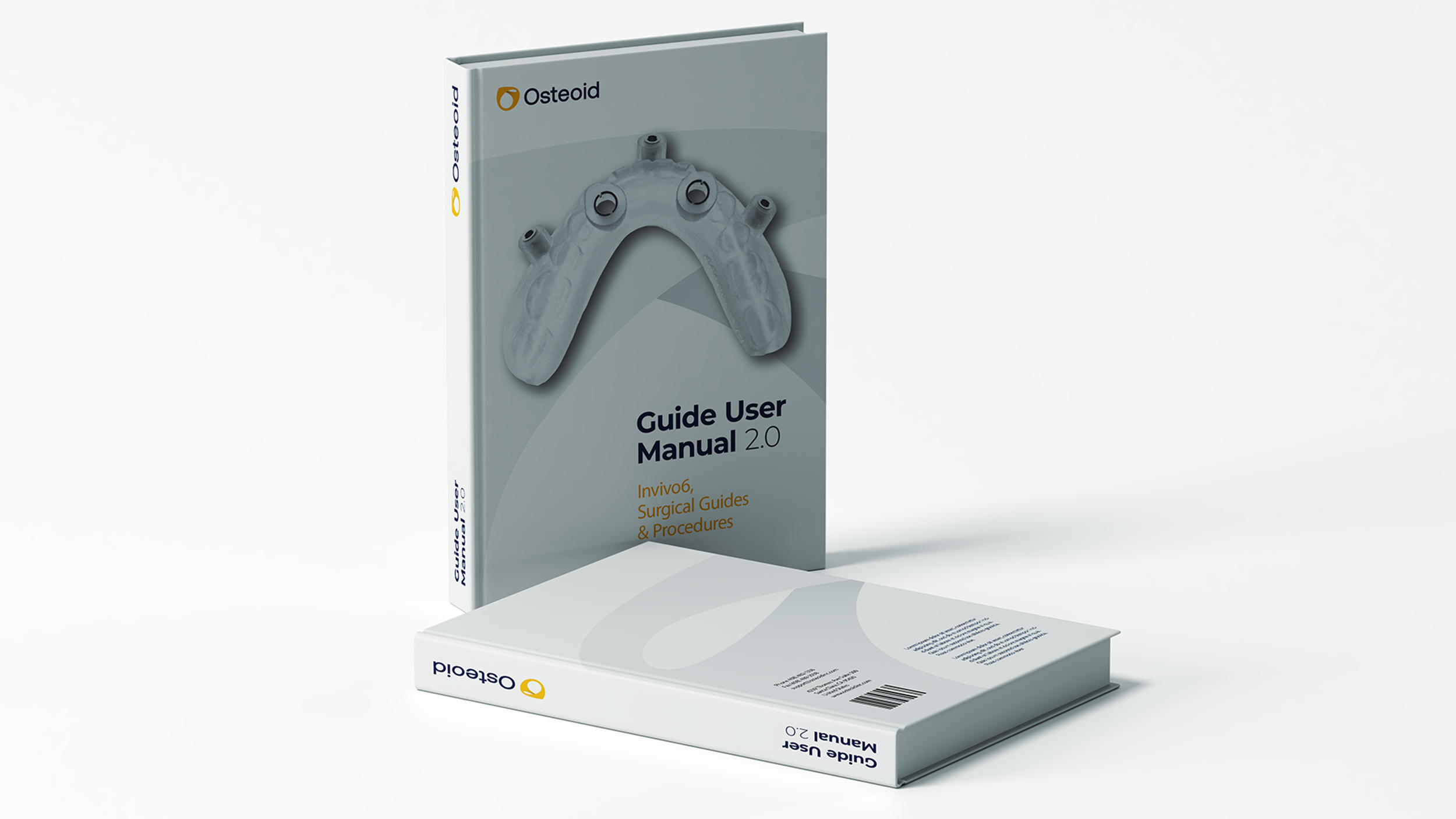
In 2020 Anatomage split into two companies. Anatomage remained focused on medical education technologies while Osteoid focused on Anatomage's dental products and services. While at Anatomage I was involved with updating the UI/UX for Invivo, a 3D software for dentists and surgeons. I was also part of the marketing and development for their dental products like Guide, 3DS, and Cloud based services.
I also helped with improving the internal login pages doctors used to order Guides, and manage their patient files and cases. It's sensitve and confidential information but I will show you what I can and my thought process for how we changed it.


Osteoid Dashboard
UI/UX Case Study
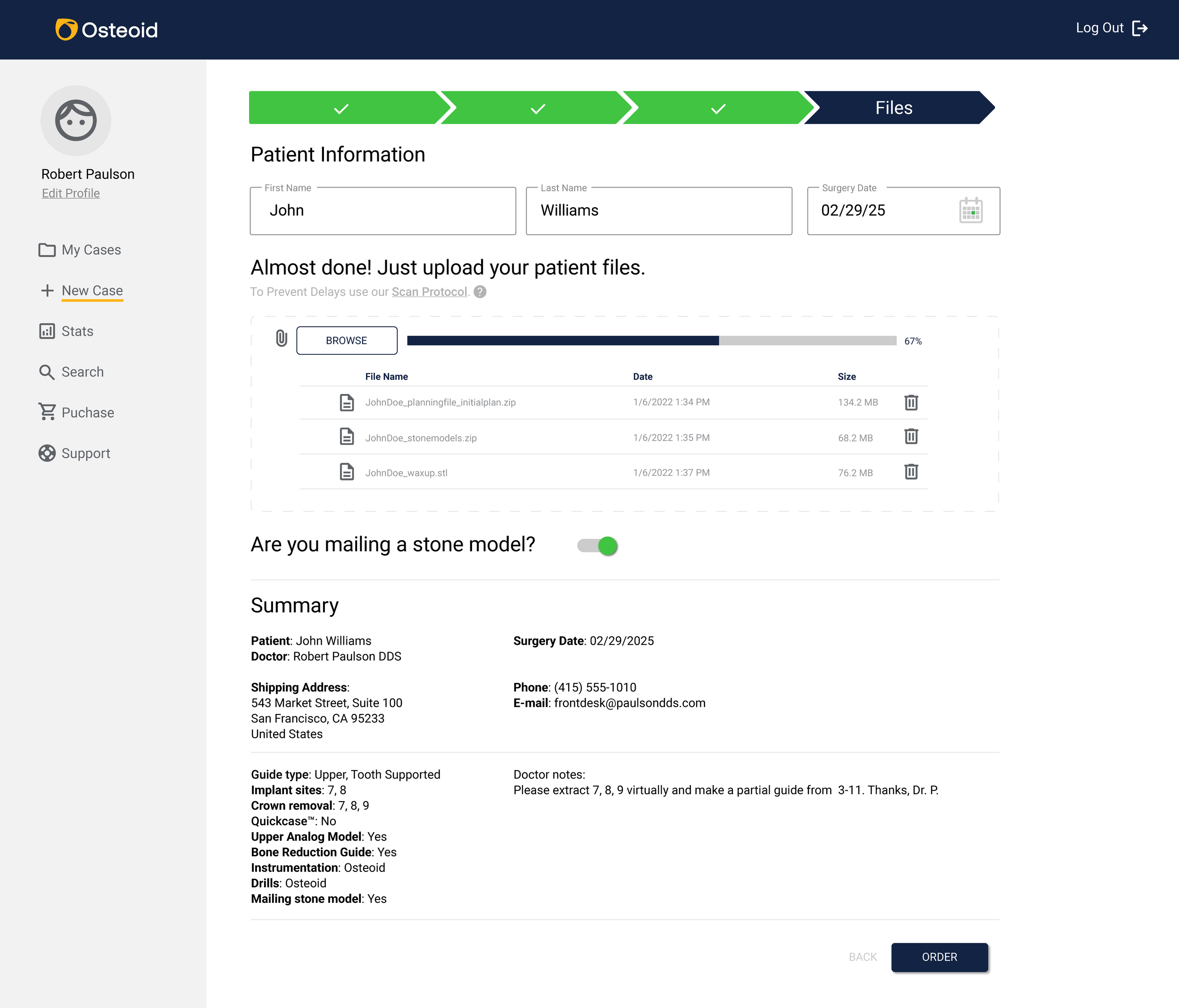
I redesigned a clinical, web-based dashboard for dental surgeons and implant specialists to upload patient data, order surgical guides, and coordinate files with Osteoid Inc. The tool simplifies a once clunky, multi-step workflow into an intuitive, step-based digital interface.
Context & Problem
The Challenge:
Design a modern, easy-to-use dashboard that allows doctors to:
Submit new cases in a guided workflow
Upload patient CT and stone model files
Purchase related products (drill kits, etc.)
Track case progress and statistics
Other basic dashboard features
Methods:
Competitive analysis of similar dental and medical dashboards
Heuristic evaluations of outdated workflows
Discussions with internal product team and support staff
Insights:
Doctors value speed and clarity over visual flair
Many users are not tech-savvy — the UI must be obvious
File upload is the most sensitive and error-prone step
Research
User Personas
Dr. Jessica Nguyen – Oral Surgeon
Goals: Upload cases quickly between patients, avoid errors
Pain Points: Confused by non-linear processes, hates re-uploading files
Dr. Mateo Ruiz – Implantologist
Goals: Wants a central place to review all past and current cases
Pain Points: Poor customer support in previous solutions, no file confirmation
Information Architecture
Primary Navigation (Sidebar):
My Profile (with photo link)
My Cases
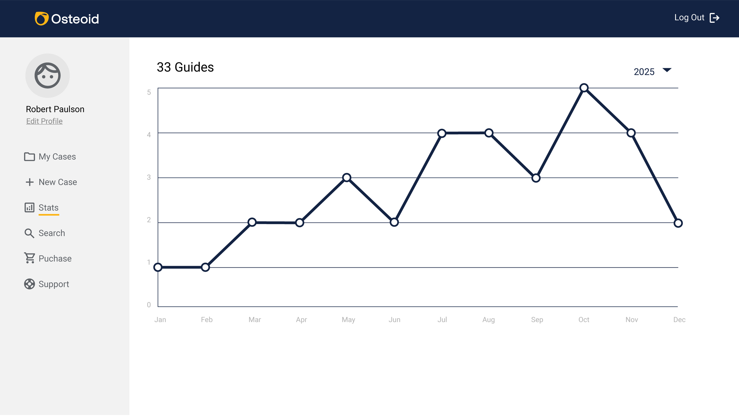
Create New Case (4-step process)
Statistics
Search
Purchase Drill Kits
Support & Help
User Flow for "Create New Case":
Step 1: Patient & Doctor Info
Step 2: Prescription (Implant site, notes, guide type)
Step 3: Quick Case (optional)
Step 4: File Upload (CT, models, planning files)
Guide Production Work Flow Overview

Wireframing & Mockups
I started with low-fidelity wireframes in Basalmiq, focusing on sidebar structure and content hierarchy. The aim was to focus only on bare essentials for clarity and ease of use.
Key Concepts:
Fixed sidebar with icon + text
Progress bar across top of "Create New Case" steps
New progress status bar in the “Case List” and “Case Page”
Osteoid Dashboard Flowchart